
Shopify App · B2B SaaS · Founding Designer
Monk commerce : Free gift, Cart upsell and BOGO
A complex promotional engine: free gifts, BOGO, cart upsells, checkout upsells. Made simple enough that 3,000+ merchants set it up without a support ticket.
Role
Solo Founding Designer
Product
Monk Commerce
Platform
Shopify & Shopify Plus
4.9★
534+ reviews · 96% five-star
3,000+
Active Shopify & Shopify Plus
✦ BFS
Built for Shopify · Top 2% of all apps
Overview
Monk lets Shopify merchants run free-gift campaigns, BOGO deals, tiered reward progress bars, cart upsells, checkout extensions, and post-purchase offers. All from a single dashboard.
I joined as the founding designer with zero existing design. My scope covered the full product: information architecture, onboarding, offer creation flows, a widget customisation editor, and a global design system that had to hold up across thousands of different Shopify store themes.
The Problem
Merchants were churning before ever seeing Monk work on their storefront. I sat with the support team, reviewed their ticket data, and mapped where the drop-offs were happening.
🧩
Too much, too soon
Creating a first offer required understanding offer types, placement rules, eligibility logic, and reward tiers simultaneously. There was no ramp. Merchants hit the full complexity on step one.
🎧
Support as a crutch
A high share of tickets were "how do I create my first offer?" Which meant the UI was outsourcing its onboarding job to human support. That doesn't scale.
🔁
Churn before value
Merchants weren't leaving because the product was bad. They left because they couldn't get to the point where it was good. A time-to-value problem with a design solution.
Research
I treated the support team's ticket backlog as a direct signal from users who couldn't tell me what was wrong themselves. Recurring themes made the problem clear: merchants arrived with a specific goal: "I want to give a free gift when someone spends ₹50." But the app opened to a blank dashboard with no path to that outcome. The vocabulary mismatch between merchant intent and product terminology was where users fell off.
01
Support Data
Catalogued ticket themes
Mapped the most frequent support questions. First-offer creation and widget visibility on storefront dominated. Both are onboarding problems.
02
Drop-off Analysis
Pinpointed where merchants abandoned the flow
Cross-referenced churn timing with product usage. The exit point was consistent: somewhere between "start creating offer" and "first offer live." Merchants weren't failing. They were stopping.
03
Competitive Review
Benchmarked onboarding in complex Shopify apps
Studied how top-rated apps with comparable configuration depth (subscription tools, review platforms) handled first-run experience and progressive disclosure.
04
Brief
Defined the constraint
Reduce time from install to first live offer, without removing the depth that merchants with advanced needs rely on.
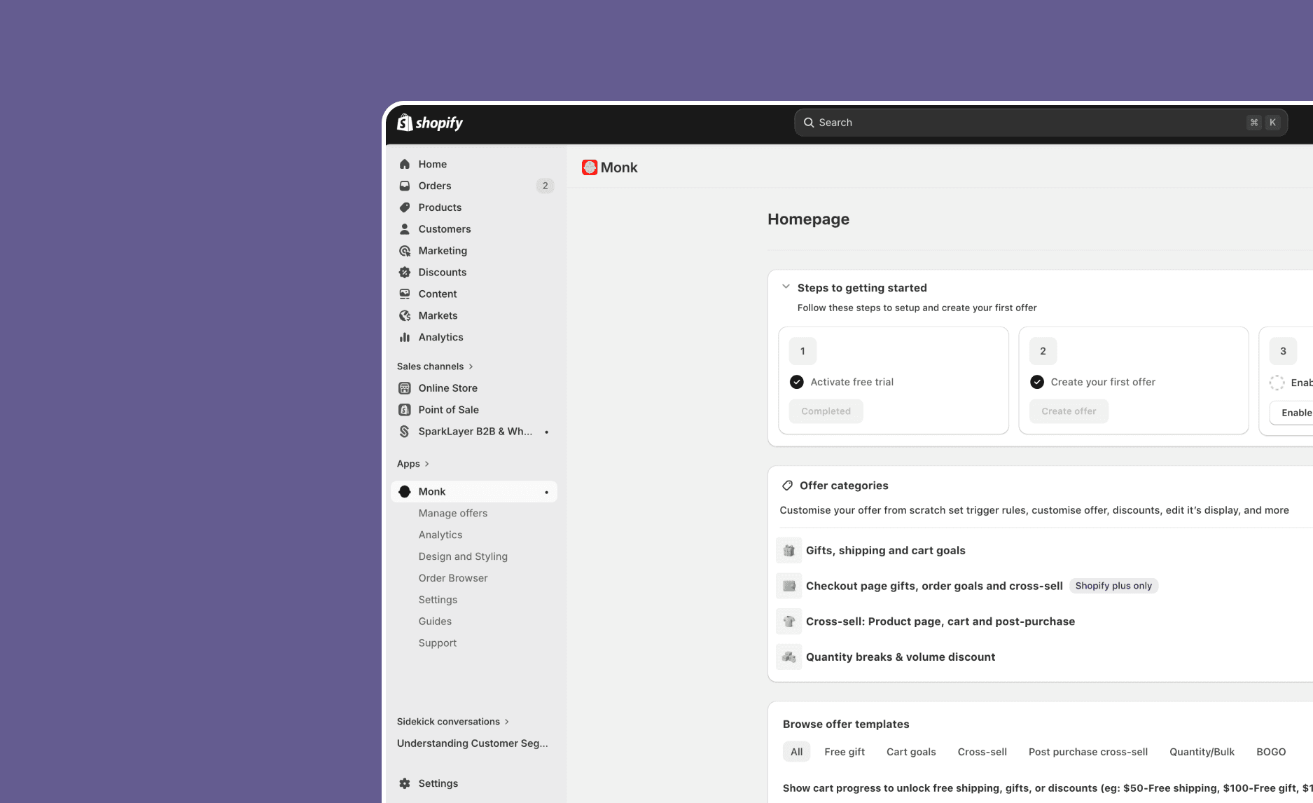
The offer creation flow
Three decisions made the biggest difference: starting from merchant intent instead of a blank form, splitting configuration from customisation into two focused parts, and showing a live summary of the offer as it was being built so merchants always knew their choices were being captured.
Step 1 of 4
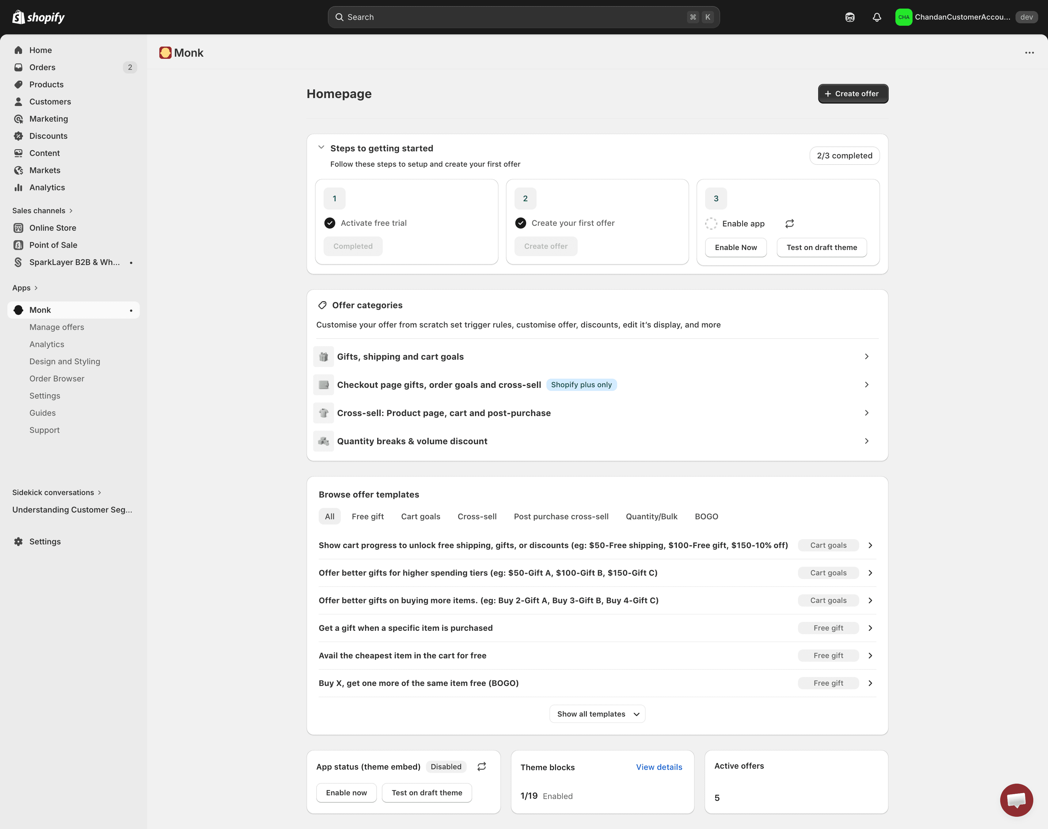
Offer categories grouped by merchant goal, not product feature names. Pre-built templates for the most common use cases. Merchants start here.
Step 2 of 4
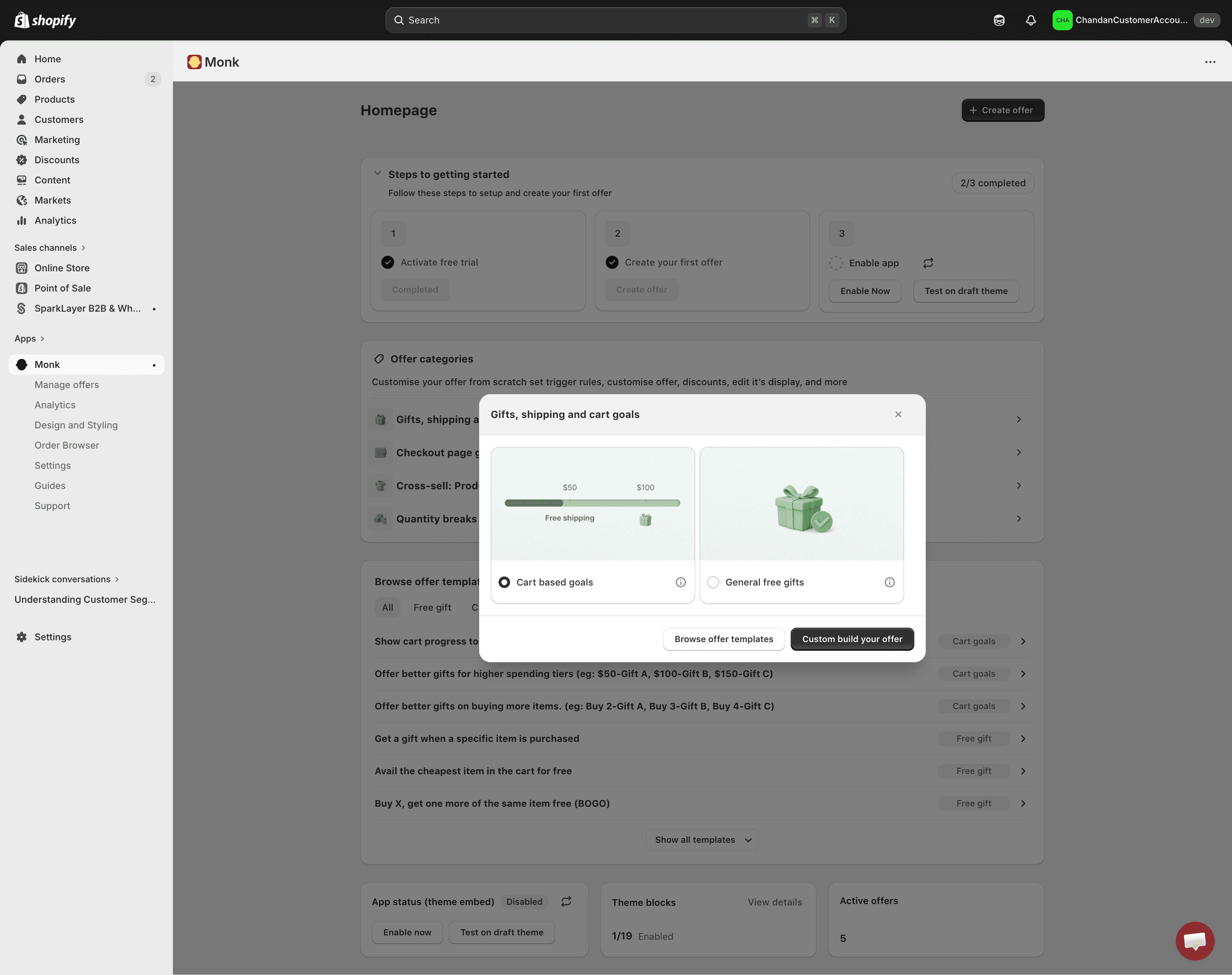
Each offer type shows a miniature storefront preview. Merchants choose by what it looks like, not by a label they don't recognise yet.
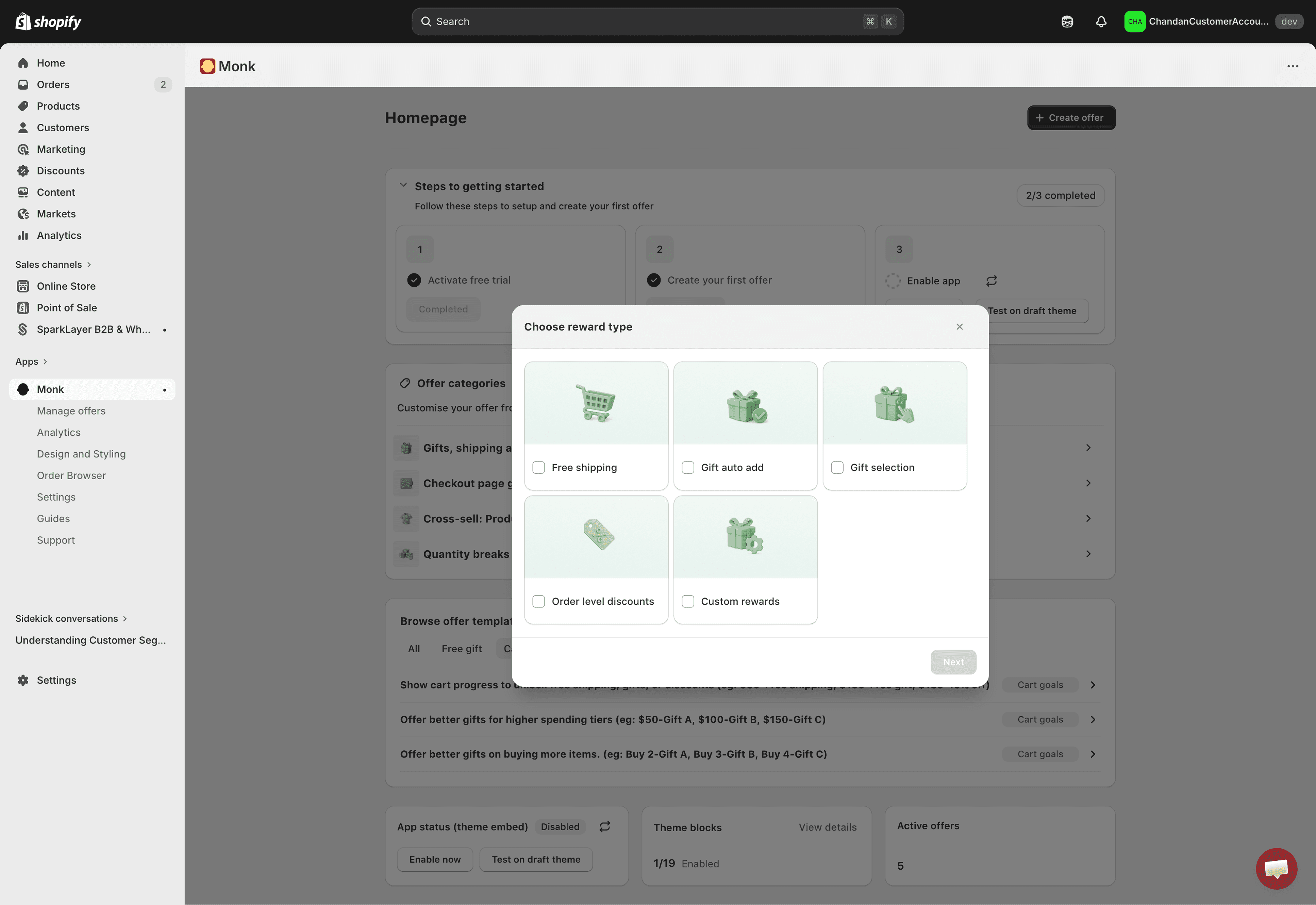
Step 3 of 4
Logic
Where the offer shows, who sees it, what they need to do to qualify, and what reward they get. Separated from visual decisions so merchants aren't toggling between rules and styling at the same time.
Step 3 of 4
The Offer Overview sidebar
Builds up in real time as the merchant configures Part 1. Acts as a running receipt confirming every choice is captured. Removed the most common anxiety: "I set this up but I don't know if it worked."
Step 4 of 4
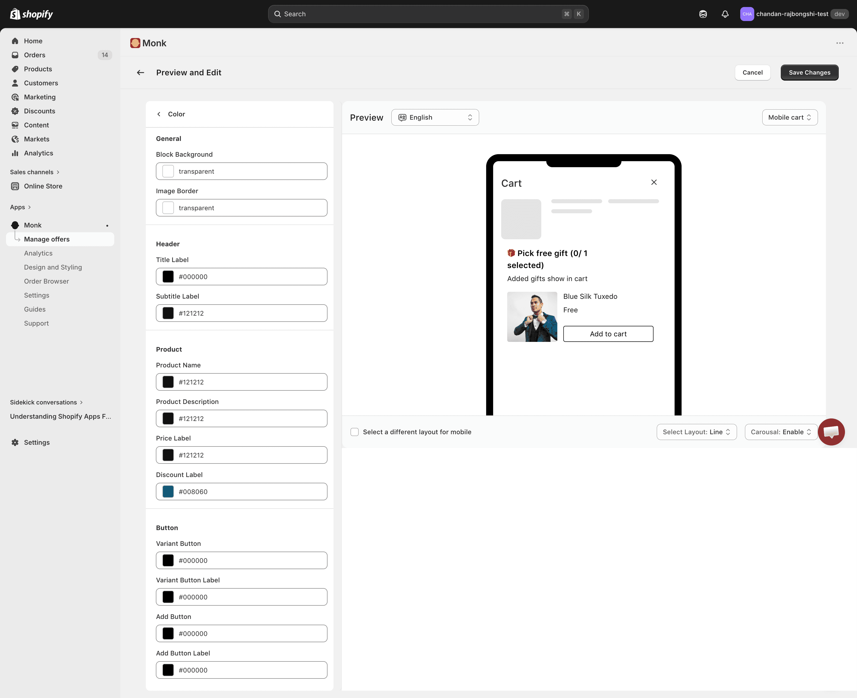
Part 2 Design only, with live preview.
Once logic is set, merchants move to styling: text, colours, layout, reward image. A live device frame shows the exact widget output with real copy as changes are made. No publish cycle needed to see what buyers will see.
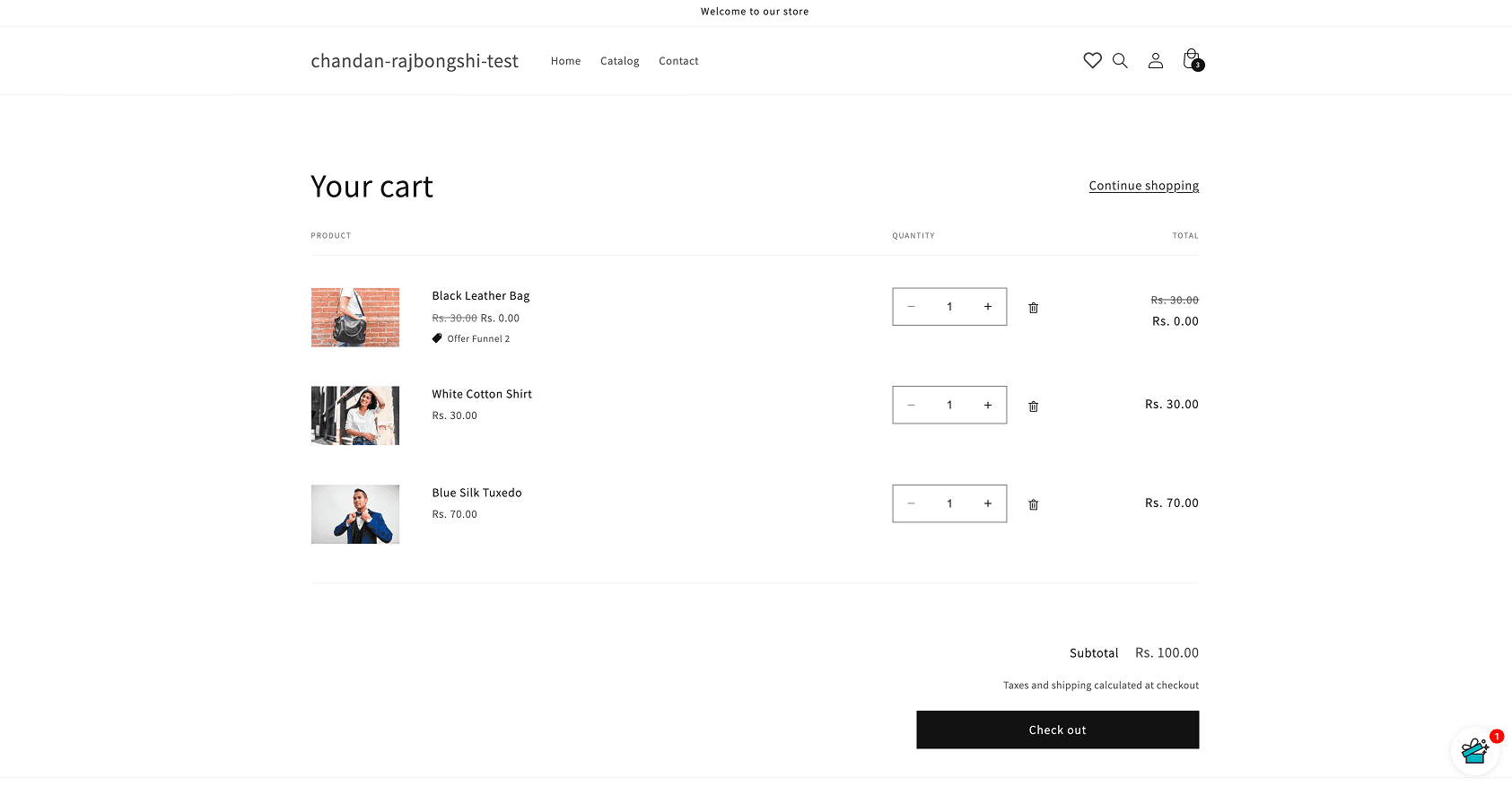
Storefront impact
All of the admin configuration produces one thing: a widget that lives inside a merchant's storefront. This is the most direct way to show what Monk does. The same cart, with and without the app running.
Without monk
A standard Shopify cart. No reward visibility, no incentive to spend more, no gift mechanic. Merchants have no lever to increase order value at this stage.
With Monk
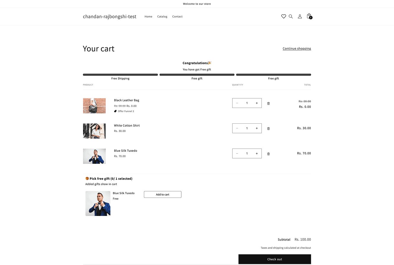
The same cart with Monk running. A tiered reward progress bar shows buyers how close they are to the next milestone. A gift selector appears when they qualify. Both configured by the merchant in minutes.
Monk outcome
$40k additional revenue per month with Monk
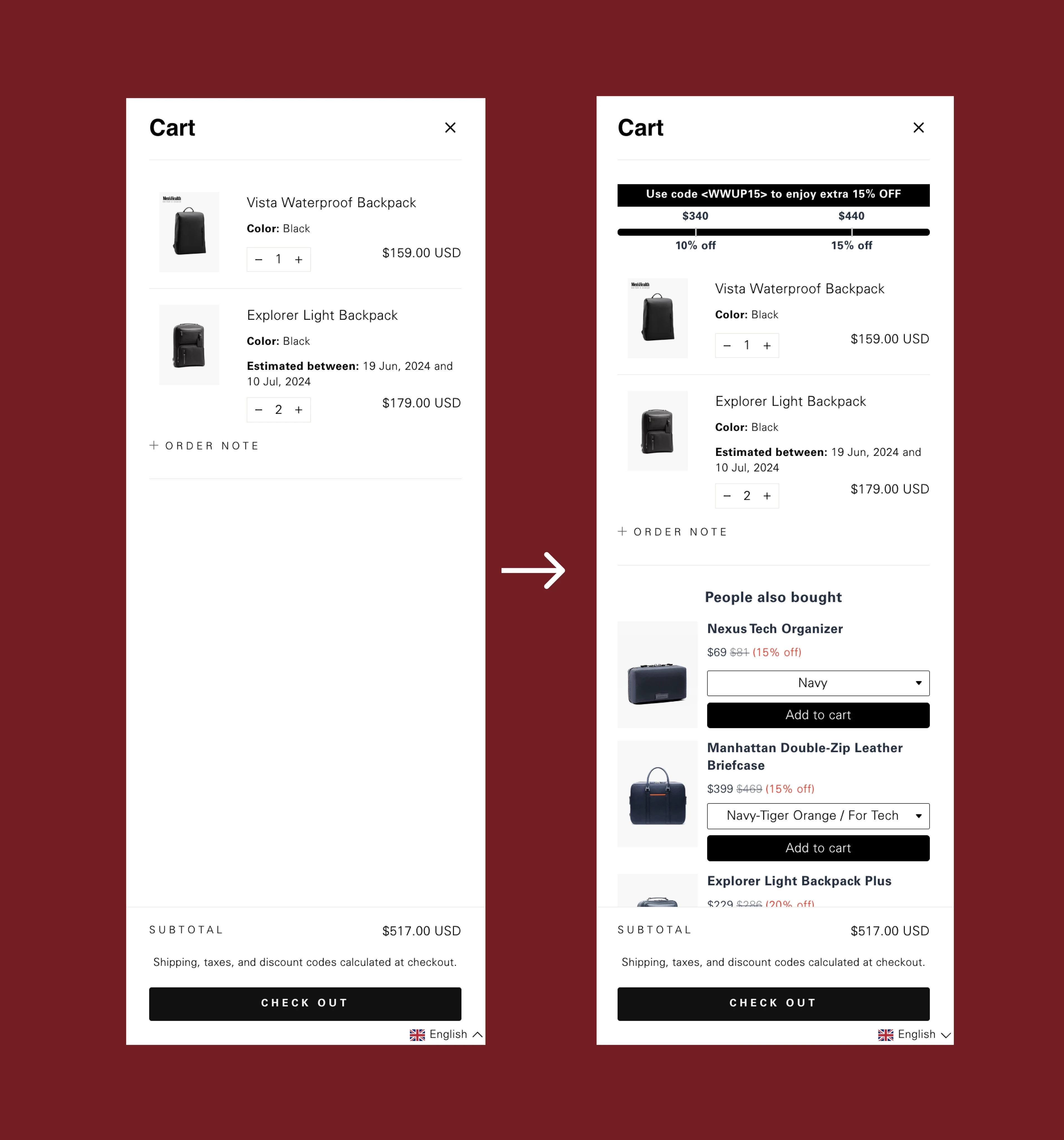
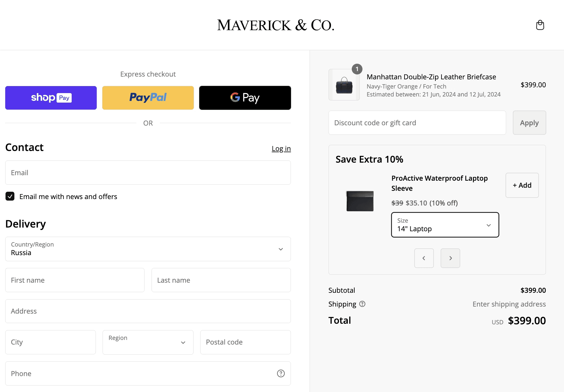
Maverick & Co is a global luggage brand selling across 10+ countries. Their Manhattan Briefcase was named Best Briefcase of 2024 by Forbes. They came to Monk looking for a way to gamify their native cart without replacing it , no cart drawers, no third-party overlays. Just their existing theme, made smarter.
They used two Monk features: a tiered progress bar with percentage discounts at cart value thresholds, and personalised cross-sell recommendations based on what was already in the cart. The setup was then cloned across all their international markets using Monk's Shopify Markets integration to match local currencies and languages automatically.
$40k
Additional USD revenue driven per month
12+
Months live with no drop in conversion rate
1-2h
Per week to maintain and track via in-app analytics
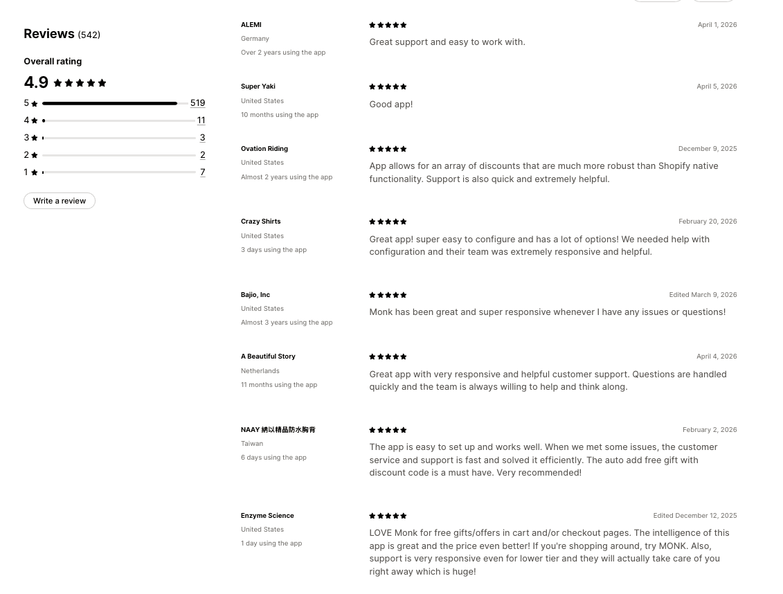
Customer reviews
Design System
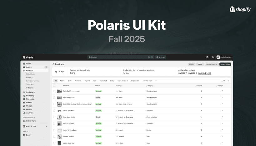
Built on Polaris
Monk is a Shopify embedded app. Every design decision had to work within Polaris, Shopify's design system. Working inside this constraint pushed me to think systematically before aesthetically. The question was never just "does this look good?" It was "does this feel native, is this component used correctly, and will this pass Shopify's review?" The BFS certification is partly a design audit result.
What this project taught me.
01
Support tickets are user research. The backlog gave me clearer signal than any survey. Real users, real friction, in their own words.
02
Templates are translation, not simplification. Merchants didn't need fewer features. They needed the product to match their vocabulary. Templates closed that gap without touching the feature set.
03
Visible state reduces abandonment. The Offer Overview sidebar made configuration anxiety disappear. When merchants can see their choices being captured in real time, they stop second-guessing and keep going.
04
Churn before value is always a design problem. When users leave before reaching the product's core value, the question is: why can't they get there? That answer lives in the design, not in the product.
The product is live and growing.
See it on the Shopify App Store.
© 2026. All rights Reserved.
Chandan Rajbongshi