Challenge:
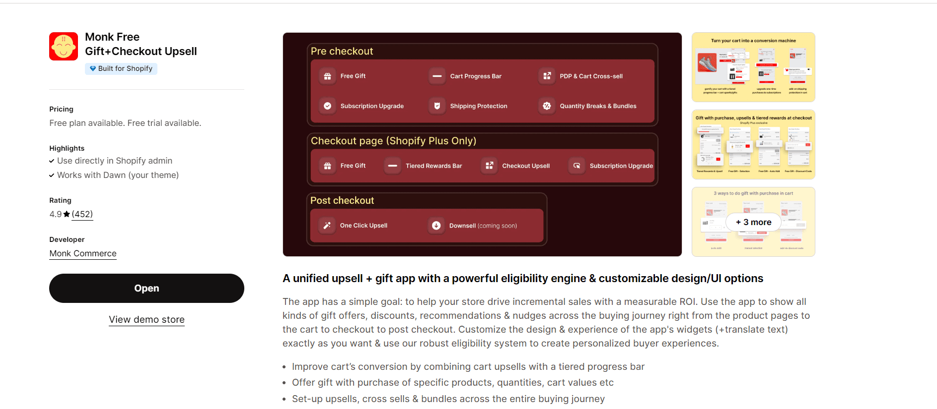
Shopify store owners struggle to create and launch effective upsell offers within their stores. Complex user interfaces and a lack of intuitive workflows hinder this crucial sales strategy.
Solution:
Working as part of a collaborative team (including PM and developers), I employed a Lean UX approach to design a user-friendly experience for the Monk Cart Upsell & Cross-Sell app (functionalities remain confidential).
Process:
User Research: Conducted user interviews with Shopify store owners to understand their pain points regarding upsell creation. Key findings revealed difficulties in setting up upsell rules and navigating complex interfaces.
Design & Iteration: Leveraging the design system, I focused on creating a streamlined user flow for upsell offer creation. Wireframes and prototypes were iteratively refined based on user feedback obtained through usability testing.
Usability Testing: A/B testing with Shopify store owners ensured the final design solution was intuitive and efficient.
Results:
The new design simplifies the process of creating and launching upsell offers within the Monk Cart Upsell & Cross-Sell app (specific results remain confidential due to NDA). This empowers store owners to leverage upselling more effectively, potentially increasing their conversion rates and sales.
My Role:
As a UX designer, I played a key role in:
User research and problem identification
User flow development and wireframing
Prototyping and usability testing
Collaboration with PM and developers to ensure a user-centered and technically feasible solution
Tools & Techniques:
User Interviews
Lean UX Methodology
Design System
Wireframing & Prototyping
Usability Testing

